


10 Tech Company Comparison
There are many articles on the web that are comparing tech companies by revenues and their products. But I would like to discuss this topic from the aspect of an employee. I made a selection of top 10 tech company in Bay Area and compare them by salary and happiness/stress level. This infographic will help people to previsualize the career before they get in. Target audience are students, engineers, and tech people who are interested in getting a job in these companies.


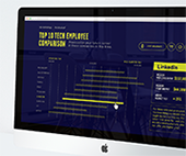
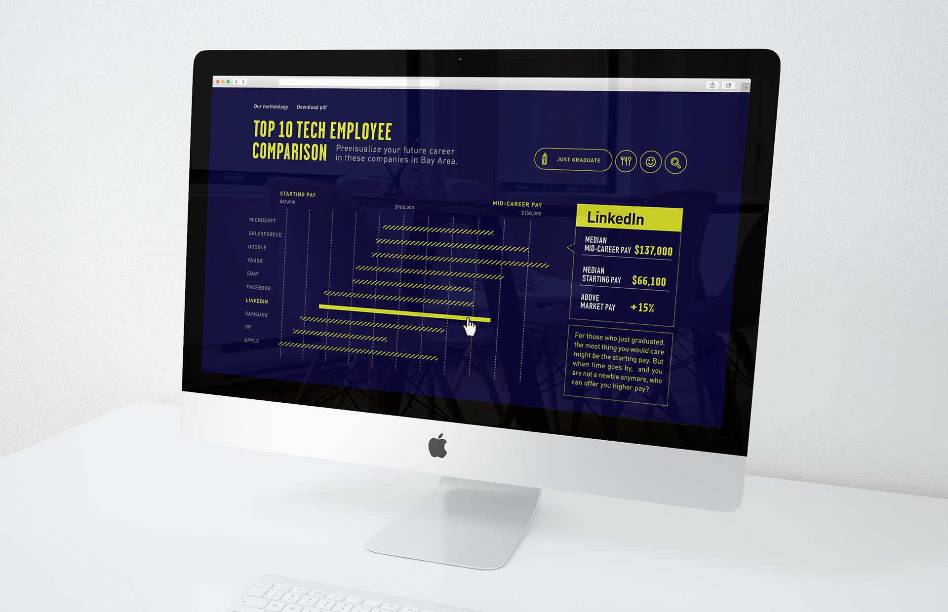
Comparing by Salary
There are ten yellow bars show how much money these companies are willing to pay to hire a newbie and a senior. You can find Entry-Level pay at the left end of the bar, and at the right side of the bar, for Mid-Career pay. The infographic gives you not only the numbers of the salary for you to expect, it also give you a overall look of which compay has bigger salary growth.
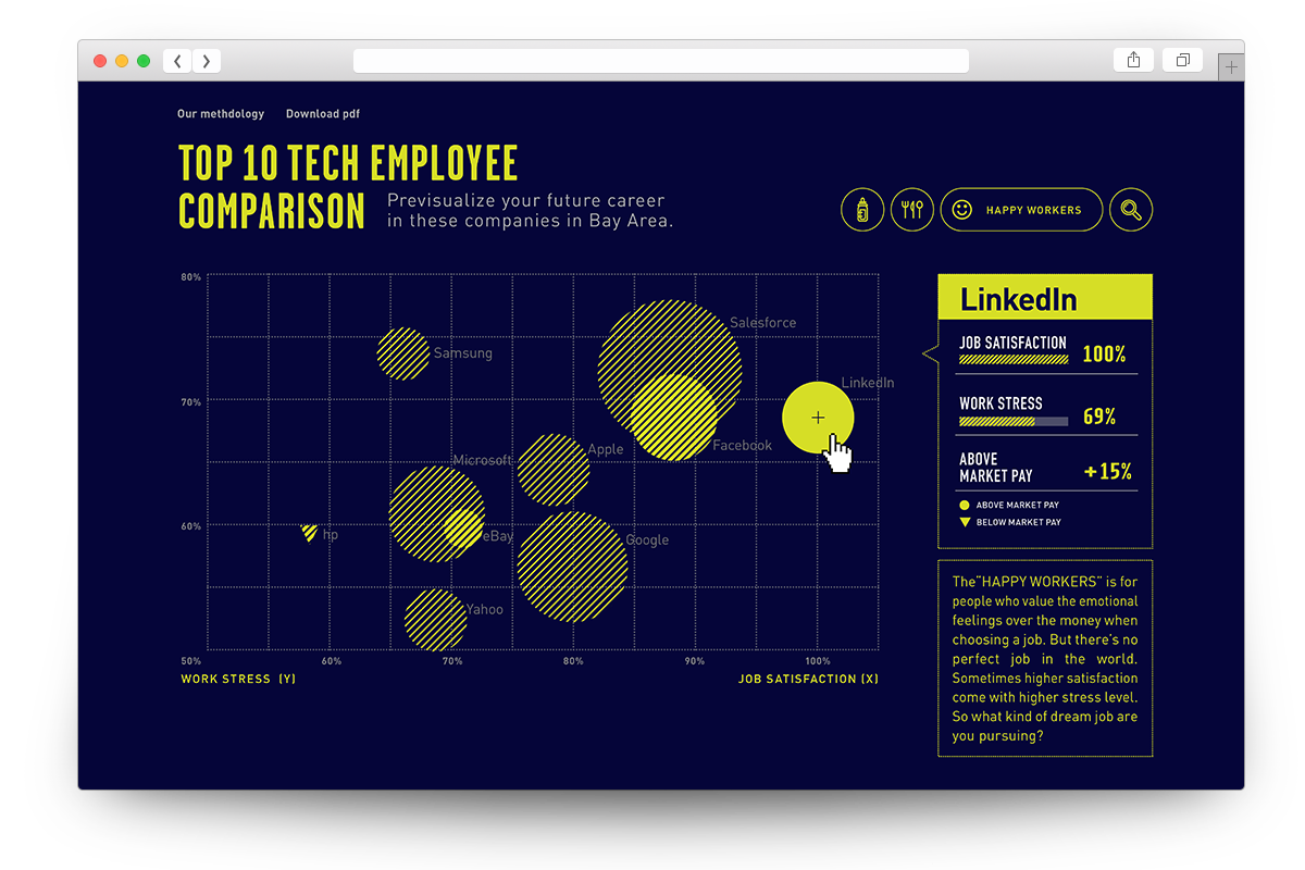

Comparing by Happiness
The second thing when considering a job offer is the culture and overall feeling to work in this company. So I wanna compare these compaies by level of stress and job satisfaction to see if they are in direct proportion. In this bubble chart, X axis is the level of happiness/job satisfaction from 50% to 100%. And the Y axis shows the level of stress from bottom 50% to top 80%. And as you can see, the bubbles are almost on an invisible diagonal line towards upper right. So I can assume that job satisfaction, the happiness also comes with certain level of stress and we can find some interesting facts in this correlation. For example, LinkedIn and Facebook have the same level of stress but LinkedIn has 100% job satisfaction. And Apple and Google has the same level of job satisfaction, but the stress level in Google is much lower than in Apple.
Besides of the positions of the bubbles, the size is another facter that users can look into. The size of the bubbles represent the percentage of above market pay. In these ten companies, only the salary in HP is below the market pay so I mark it a rectangle. So we can find that the people in Salesforce and Facebook have similar level of job satisfaction, and stress level is higher in Salesforce, but people also get higher pay in Salesforce too.
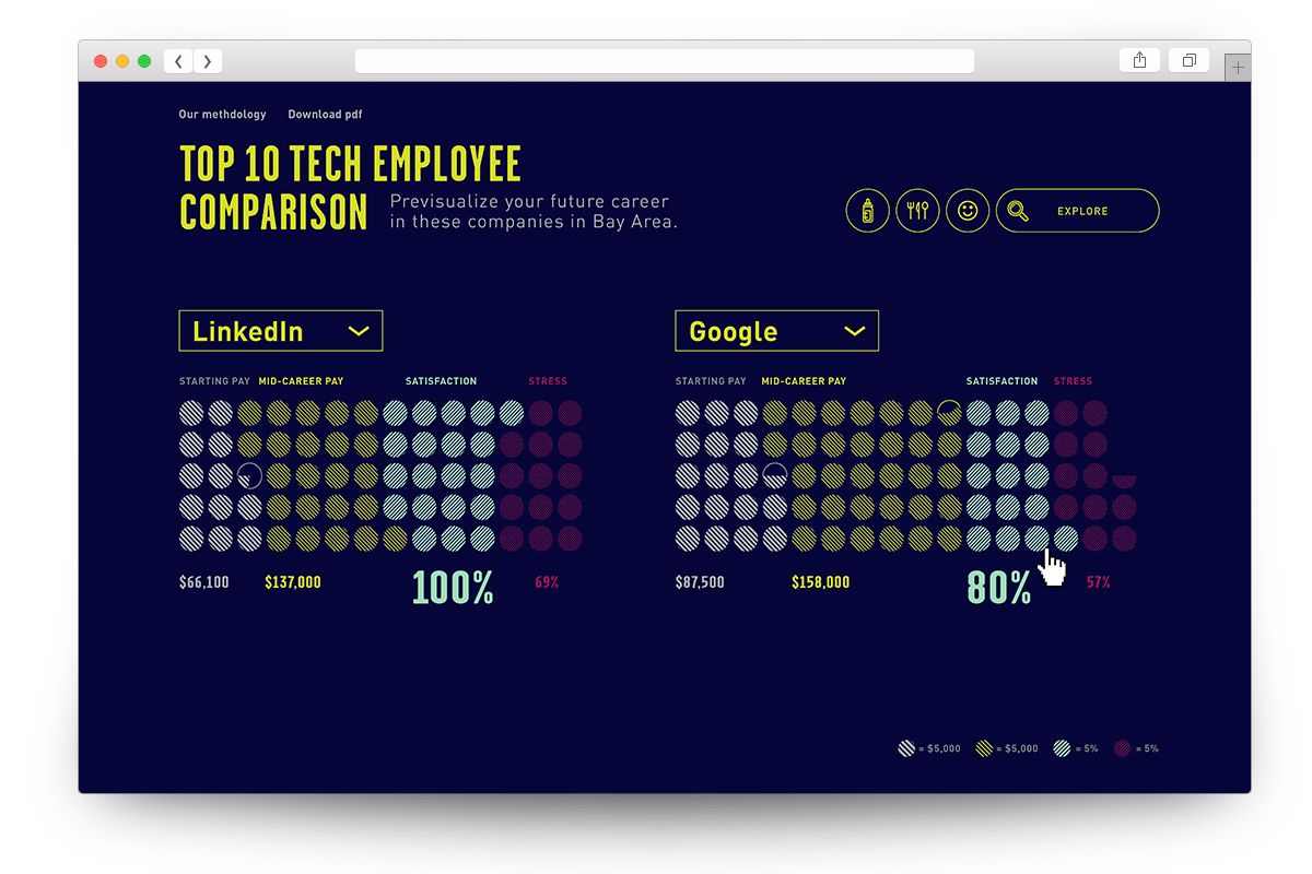

Side by Side Comparison
If you are considering two companies at the same time, this chart will help you figure it out. It lists out all the data visually and statistically side by side for you. Users can change the company easily from the dropdown menu or go back to the bar chart or bubble chart by selecting the buttons on the upper right of the site.