


Super Duper Redesign
UX/UI + ICON + BRANDING
Super Duper has always been my favorite burger place in San Francisco downtown. They are famous and have good reviews on the internet but their website is outdated and doesn't have an app on the market. So I think it would be nice to have an app that allow users to order through the app and use the technology to communicate with customers.
LOGO REDESIGN
The current logo of Super Duper is good, but it dosen't evolve with it's brand that has the modern and hip value to customers.
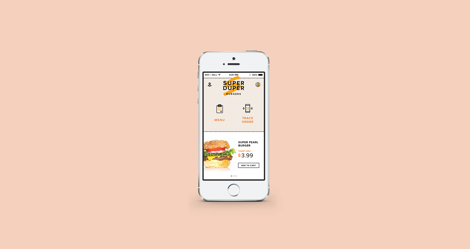
LANDING PAGE
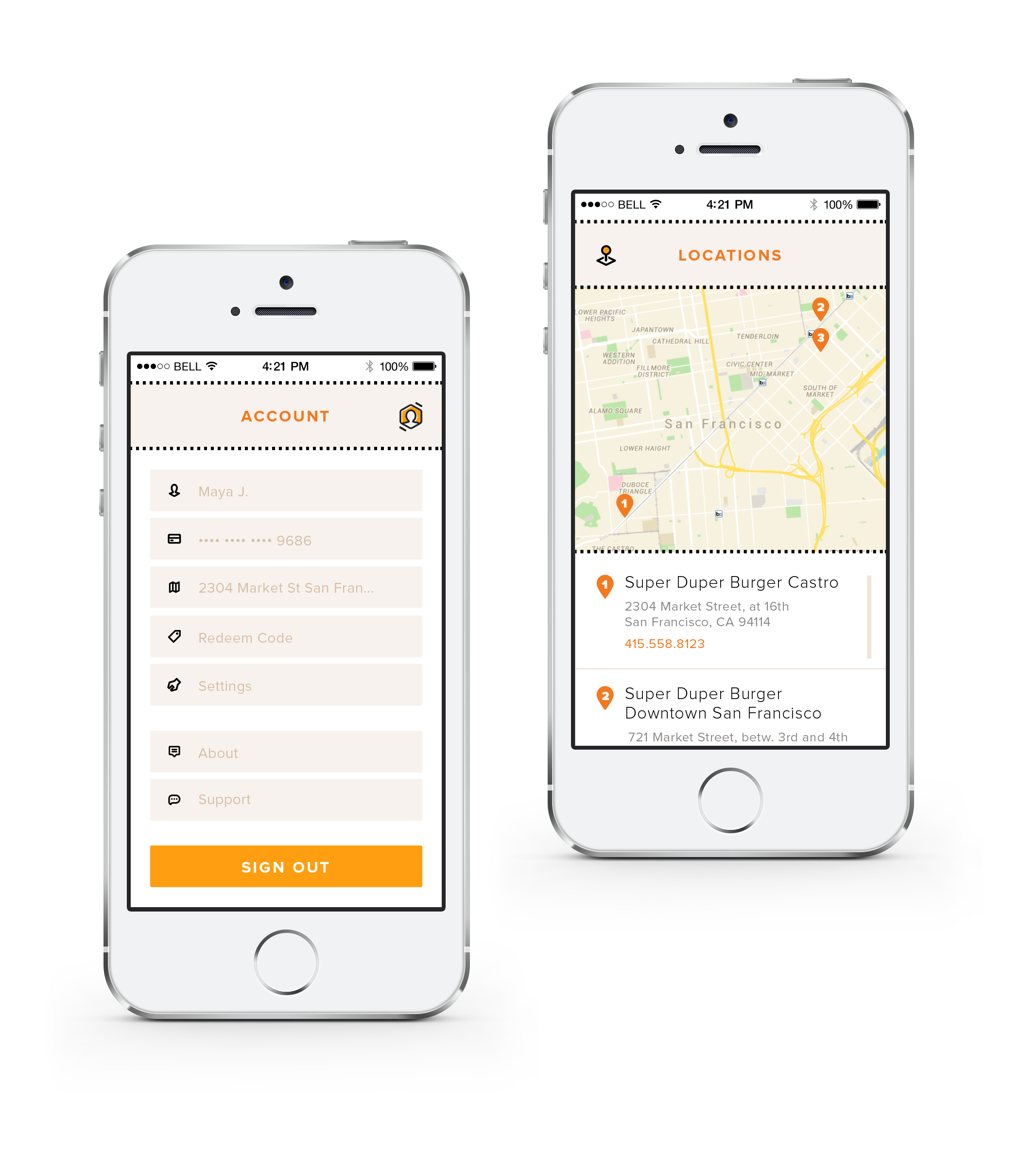
When people are using mobile, the tasks they are about to accomplish are more urgent than they are using on desktop or tablet. So when user are outside, they can find a store near by by tapping on the left top icon to get store locations. If you are waiting for your order, just tap on the track order icon to see the time and order details.
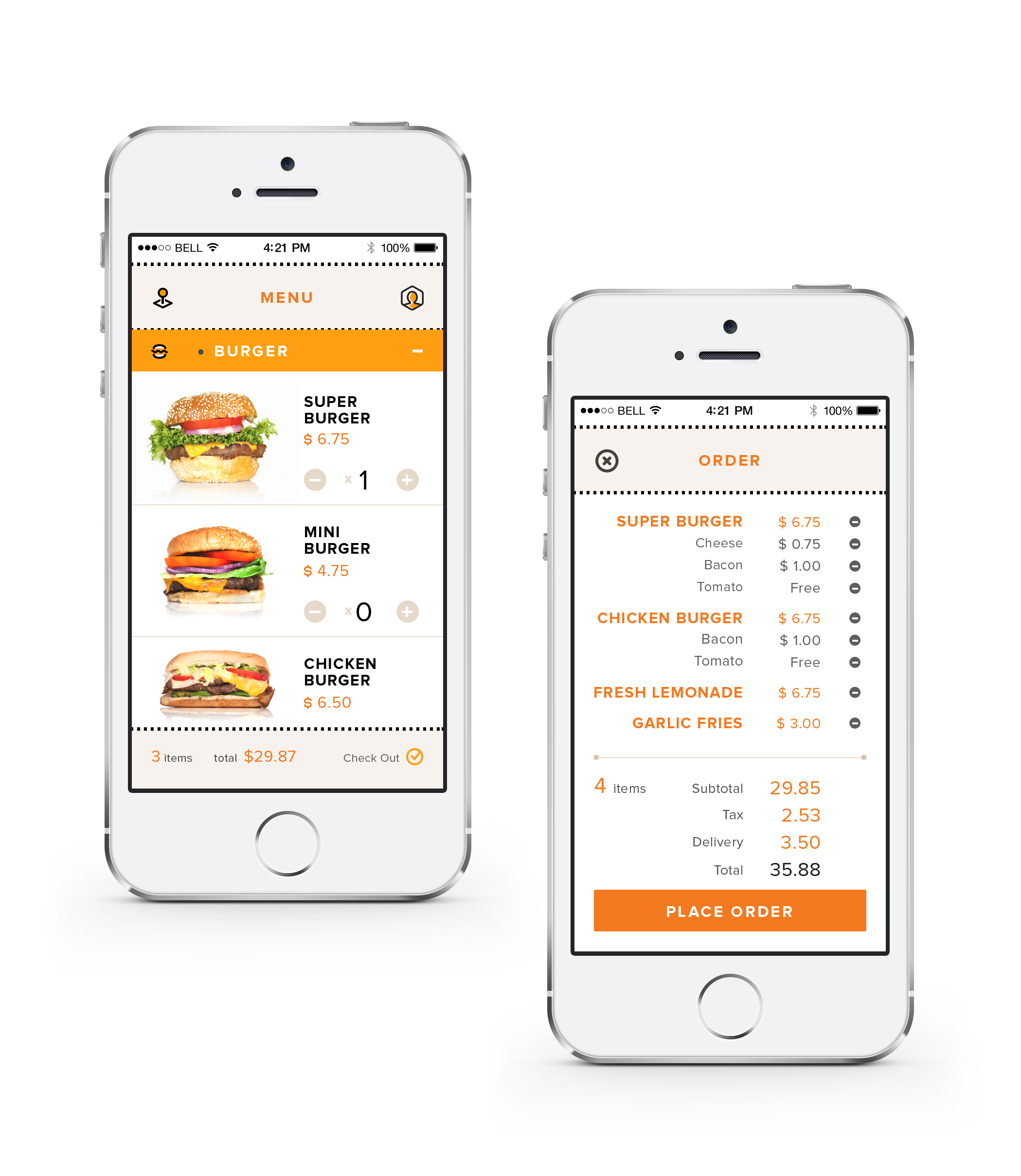
MENUS
The menu has five expandable categories wirtten in accordion javascript tool so that will be easy for customer to browse. The Special offer category is initially open to make sure customer won't miss it.


CONCLUSION
The platform serves as an quick access for customers get a meal from Super Duper. No matter it's for dine in or take out, the interface sould be easy to navigate.